While playing through the game at it’s current state it was becoming clear that for big game areas, such as the forest that will be featured in the demo, it was easy to get lost. Although it is to be fairly dense with content, relevant quest locations were far enough from each other that at times it wasn’t clear where to go. Even if one has already visited the relevant location.
Because the game will not feature objective markers of any kind, a different solution had to be found. The best one seemed to be to provide the player with an auto-map. A feature that from it’s introduction into the cRPG genre in the 80s/90s, has been seen in almost all isometric RPGs.
But adding such a feature is not that simple of a task. What should the map look like? What information should it show? How information should be represented? How should the player access it? How should it be interacted with? These and more questions needed to be answered for this feature to be ready.
This is where prototyping, fudging and iteration come in. The best way forward was to try things, experiment with different methods of the map being displayed, as well as the process for the data for the map to be created.
Early in development of the game there was a mini-map in the HUD of the game. This was deemed not very practical, as it didn’t solve any of the issues that were faced and cluttered the screen. It was good to try out, but ultimately that implementation was scrapped. Unfortunately no screenshots of that remain anymore.

Over the course of last week various implementations of displaying of the map in the game’s Map Menu were tested. That seemed to solve a lot of issues related to navigation, without detracting from the gameplay itself. However there was still a lot of details to work out.
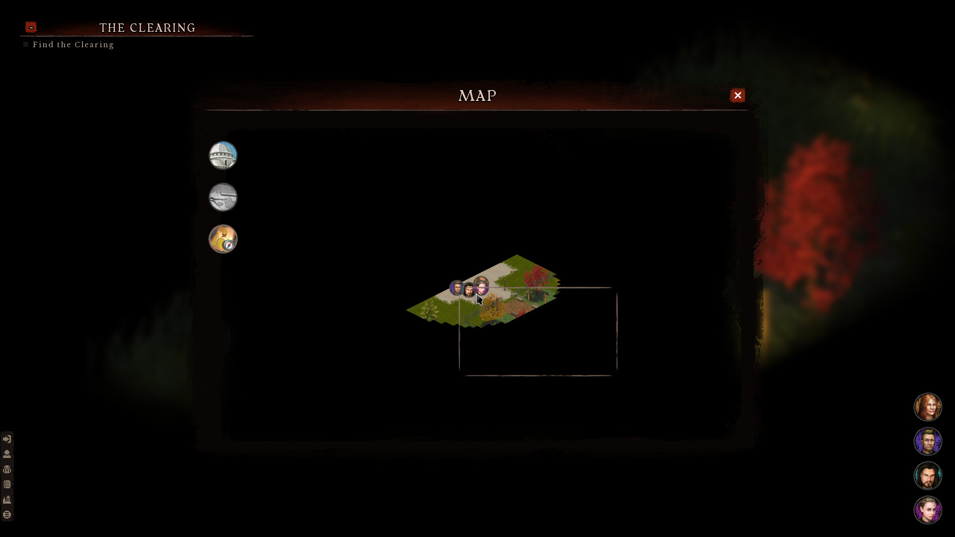
Initially the map was an image showing the whole game area, but scaled down, with some detailed icons showing player party member locations, NPC locations and various points of interest. A solution similar to the one that has been used in many Infinity Engine games and Torment: Tides on Numenera.
This although provided relevant information to the player, had certain readability issues. The image used a lot of colours, making it difficult to show clearly additional information on it. Another thing was that the image was huge, so opening of the Map Menu took noticeably longer than other menus. Also the way it looked stood out from all other menus.
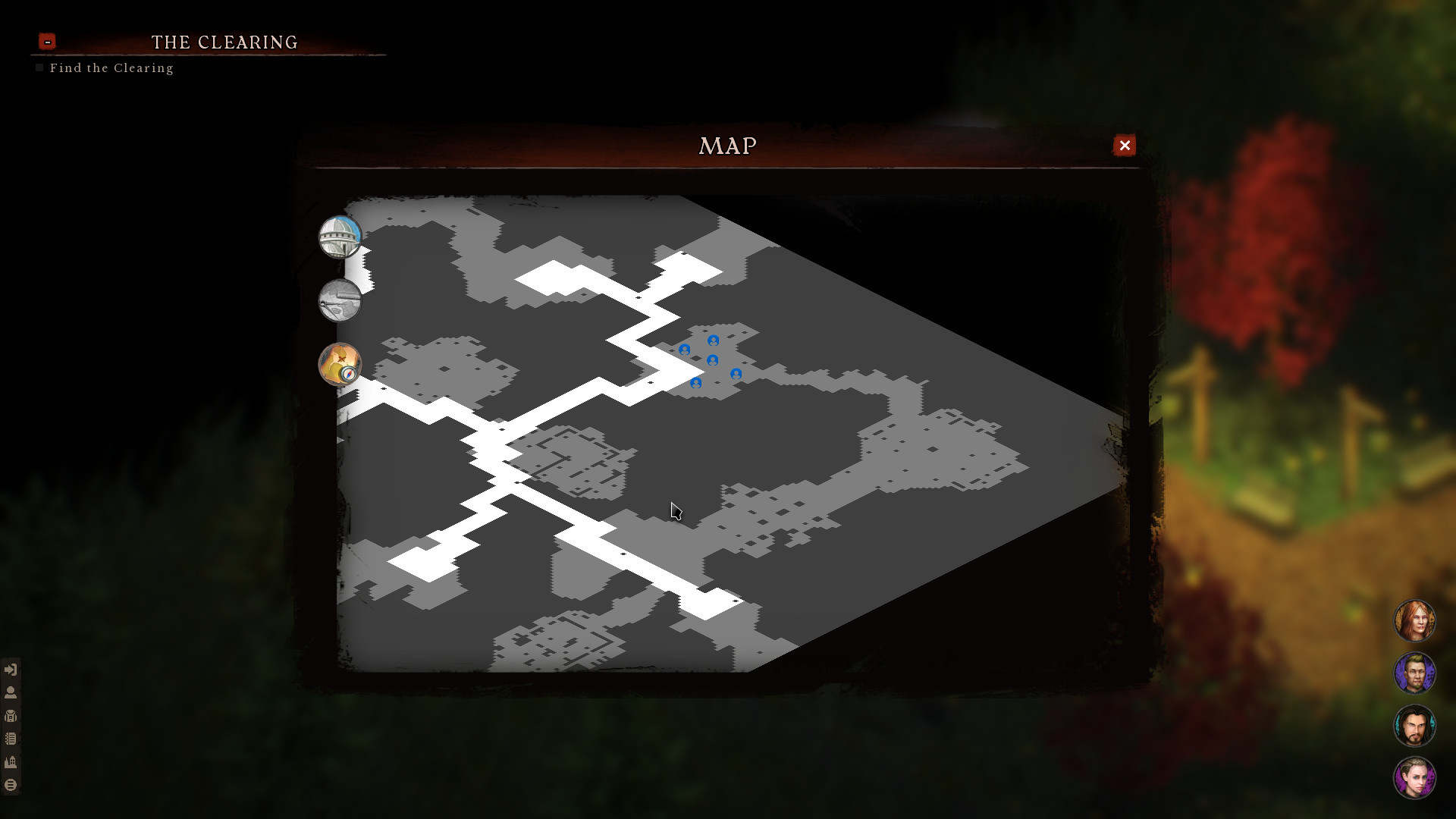
To deal with the shortcomings of the scaled-down-image representation was to use a much more symbolic map. One that would just show relevant areas as outlines and simplified icons for locations of relevant characters and points of interest. This turned out to work much better. It was clean, consistent with other menus and because it was generated from existing data, no new images needed to be created and loaded.
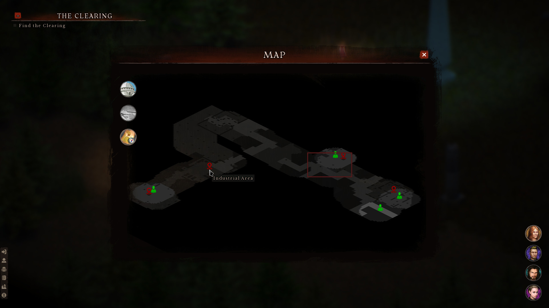
Ultimately the minimalist map was chosen as the solution. With some tweaks to generation logic and used colours, it was possible to make it load quickly and be easy to read and easy to use. This implementation seems to be solving all problems with navigation through, and orientation in the game world.
Most likely there will be more tweaks to the auto-map, but what is currently in the game works quite well, and for the time being, the implementation can be considered done.